ToBuy:
Shopping List
Shopping List
Grocery checklist with family sharing and Apple Watch support
138Kdownloads
1.6Kreviews
![[object Object]](../intro/intro-images/tobuy3.png)
![[object Object]](../intro/intro-images/tobuy4.png)
Idea & Moodboard
The idea was to create shopping list that is easy to use and stand out from other similar apps in the App Store. I have analysed top apps and created moodboard.
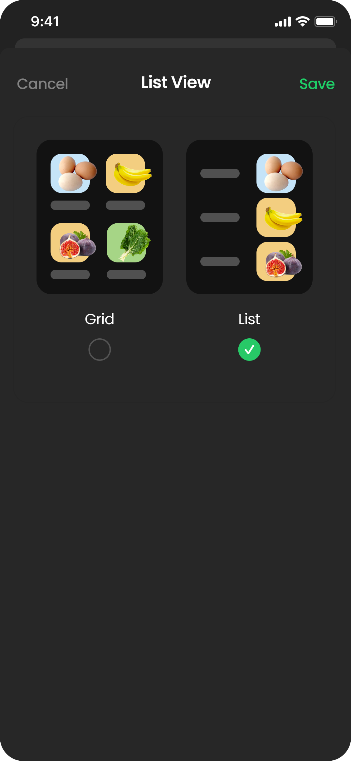
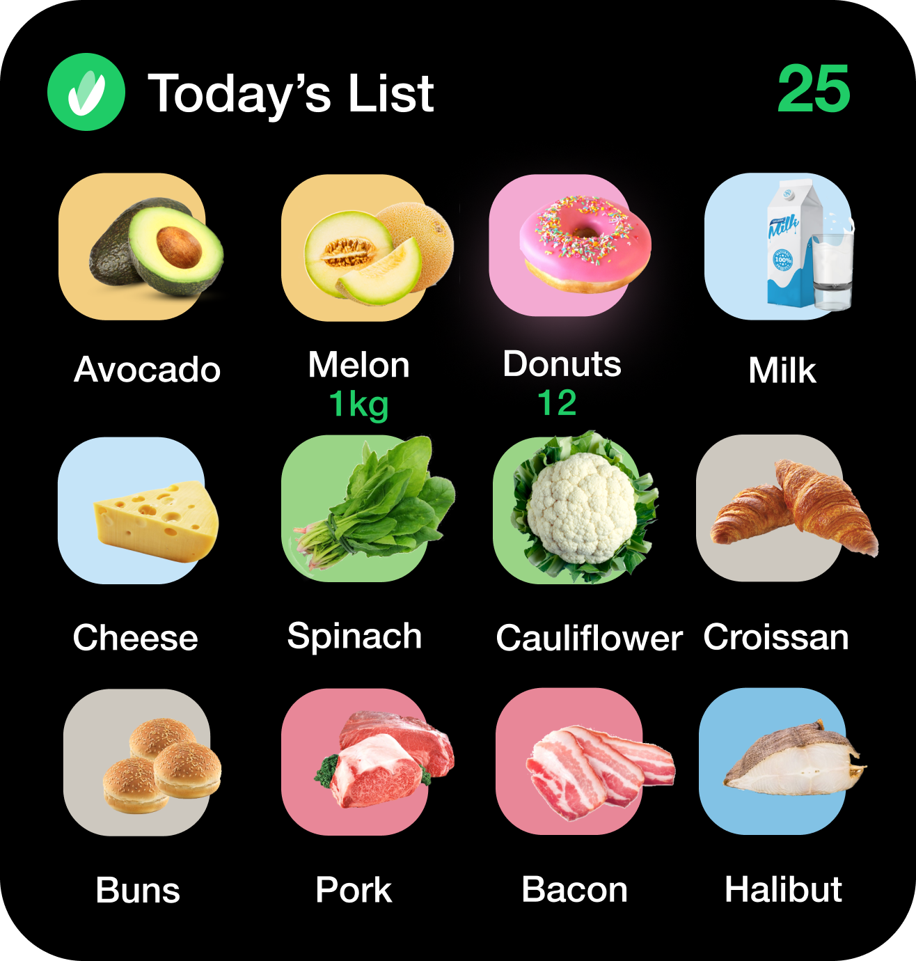
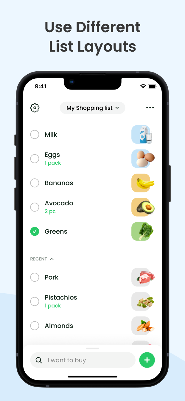
Top Apps. The majority of apps looks very simple, but some of them stand out because of big images and grid layout. This layout is easy to perceive. So I decided to look into this direction.
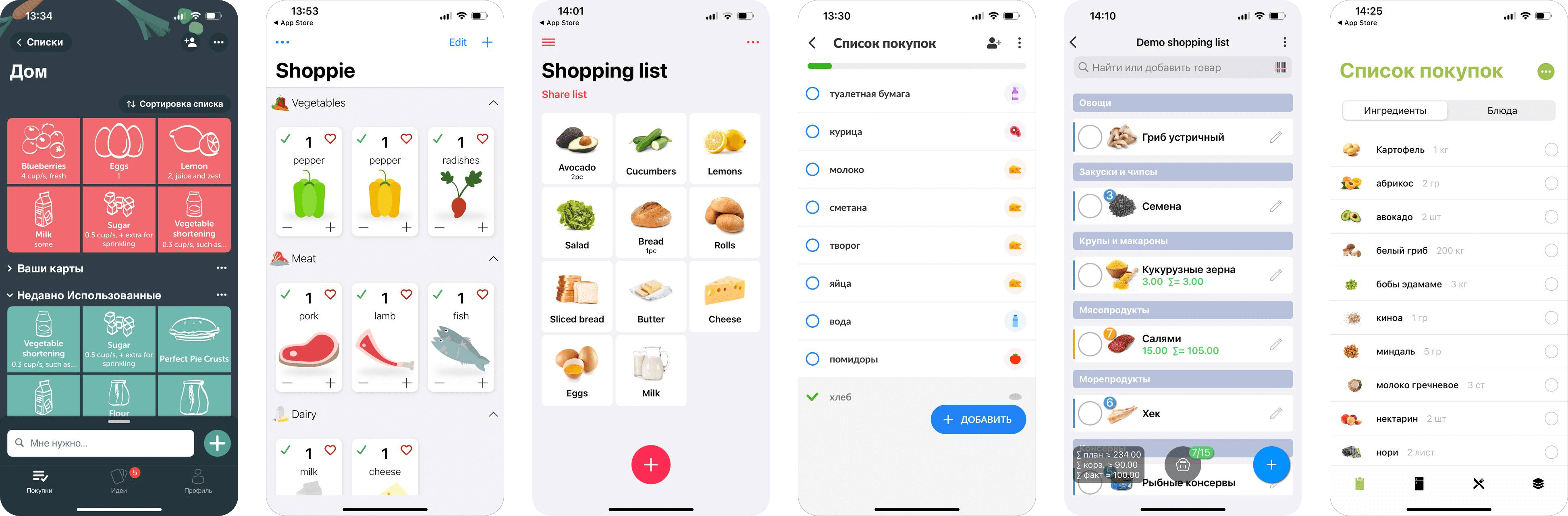
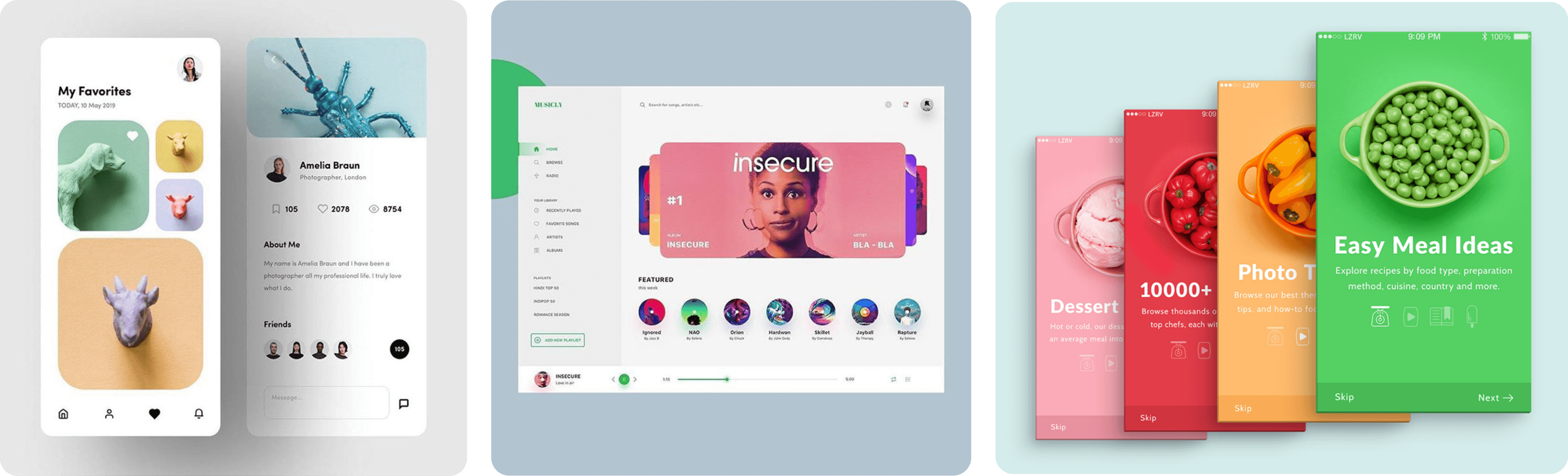
Moodboard. The vibe — colorful, rounded, clean.
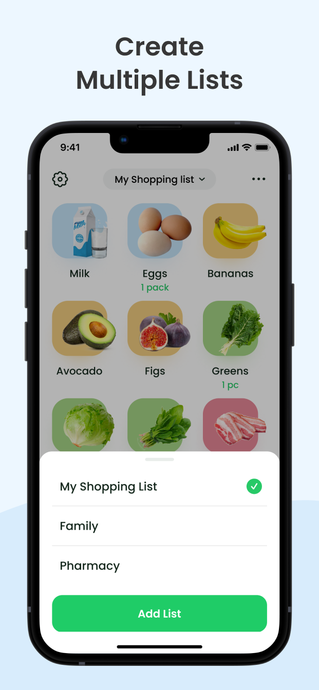
UI & Product Cases
Interface screens below represent version of the app available at the AppStore
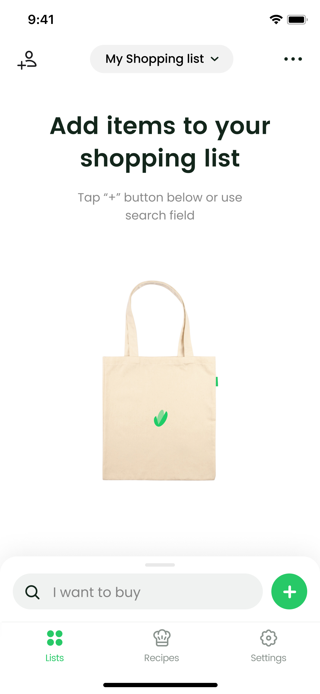
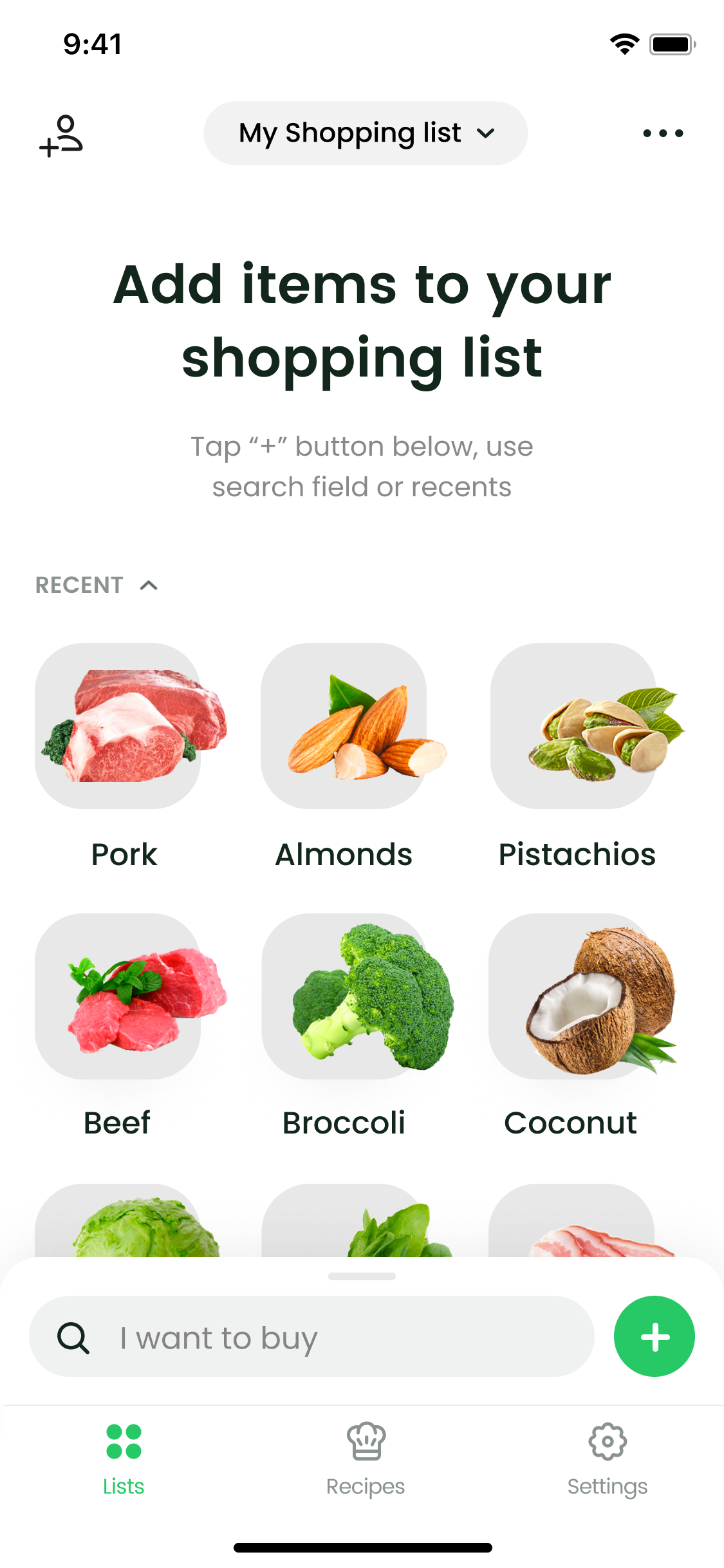
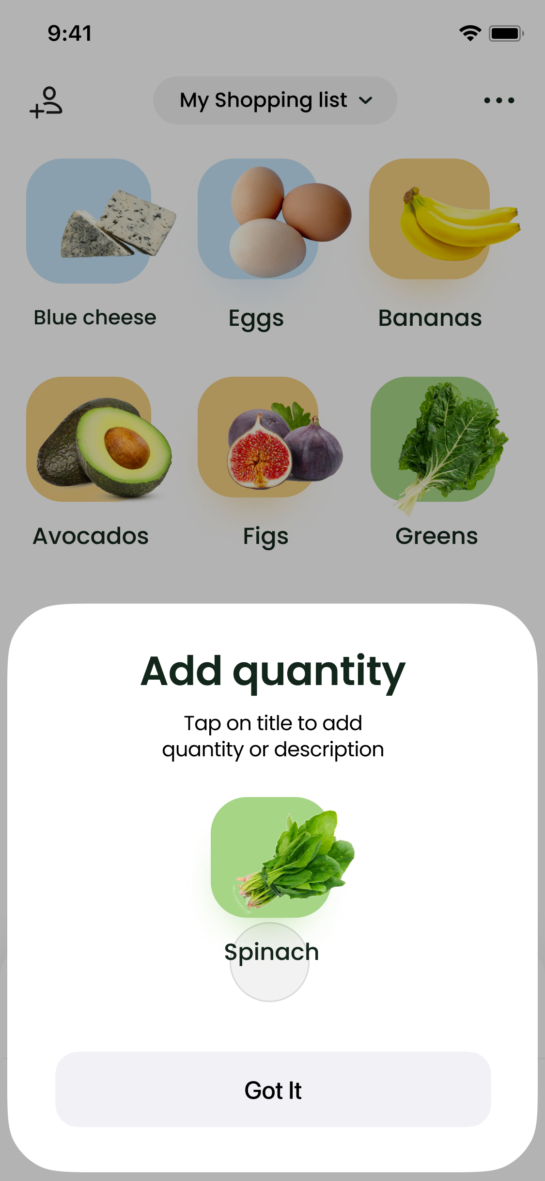

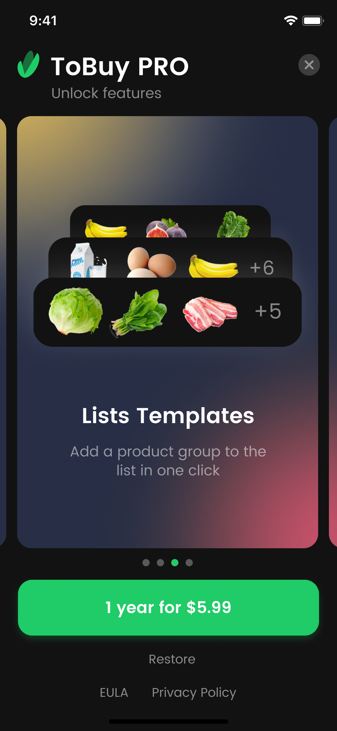
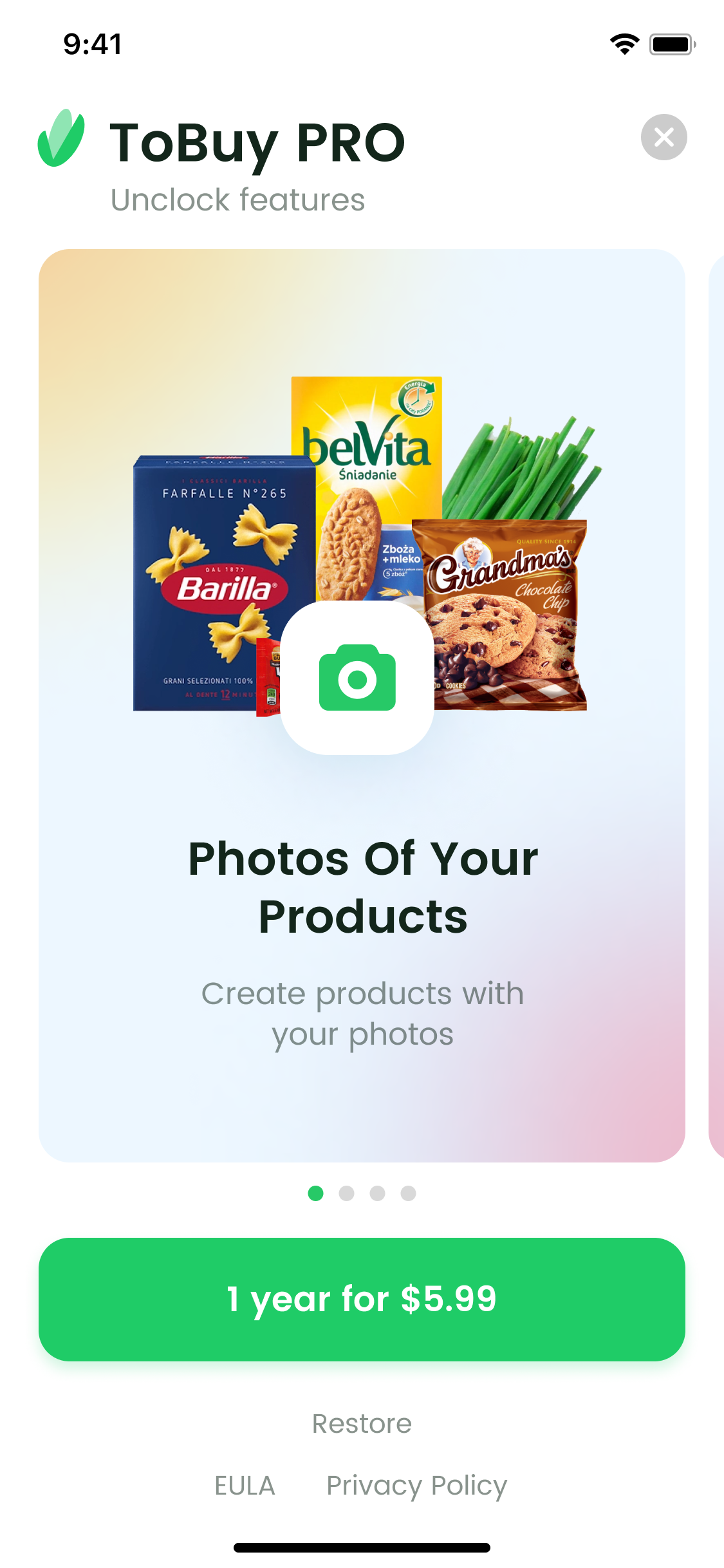
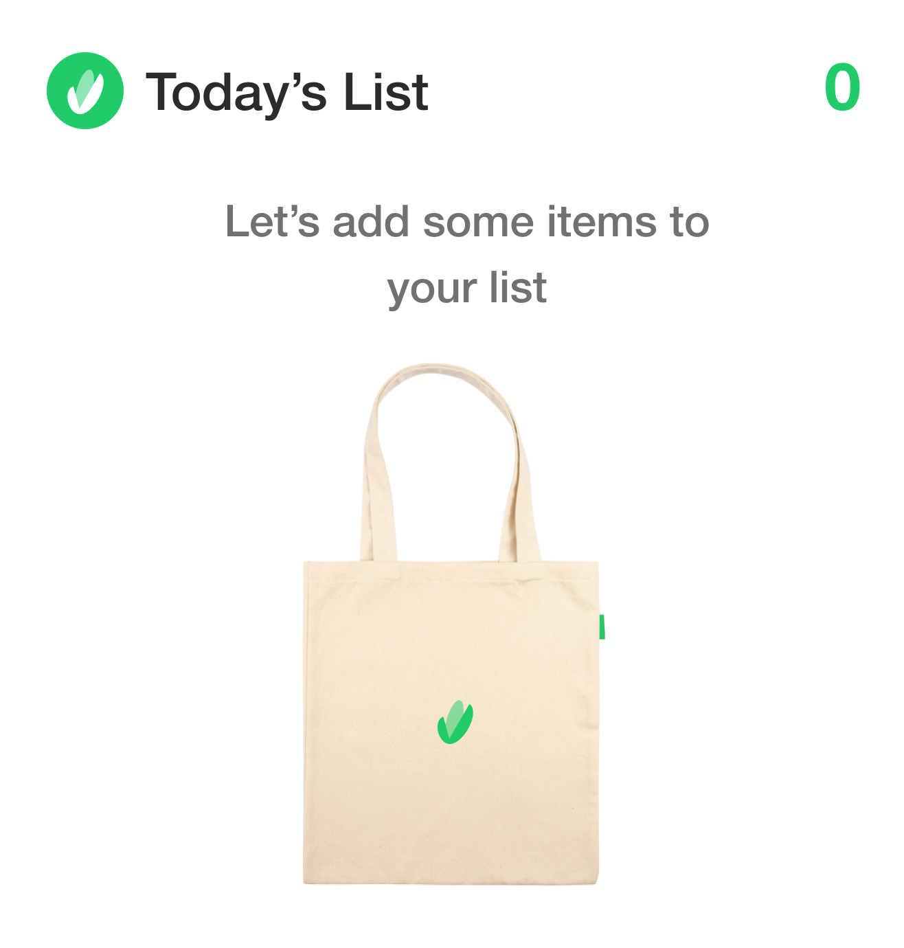
Empty State as a place to get more subscriptions
Hypothesis. If you place a subscription offer at the empty state it will bring you more paying users.
Why. Empty state is a place with a large amount of traffic. Every person that downloads app see that page. So chances to get subscriptions increase if we place an offer here.
Result. Revenue from subscriptions increased on 24% in 3 months after offer was placed at the empty state.
Why. Empty state is a place with a large amount of traffic. Every person that downloads app see that page. So chances to get subscriptions increase if we place an offer here.
Result. Revenue from subscriptions increased on 24% in 3 months after offer was placed at the empty state.
Annual Subscription vs. Lifetime Purchase
Hypothesis. People perceive an annual subscription as a lifetime purchase.
Why. We want to earn money on a regular basis. The introduction of the classic monthly or annual subscription scheme has shown that people sign up for a cheap monthly subscription and quickly unsubscribe. Therefore, a lifetime purchase was beneficial for a long time.
Result. I suggested conducting an AB test. Compare annual subscription and lifetime purchase with the same price. The hypothesis that people perceive them equally was confirmed. An annual subscription will help to earn double in a year.

Increasing the number of reviews
in the AppStore with a banner request
in the AppStore with a banner request
Hypothesis. If you politely ask people to leave a review, they will do it.
Why. The number of reviews affects the position of the application in the AppStore. It also serves as social proof when the user decides to install the application.
Result. The introduction of such a banner increased the number of reviews. The app currently receives 2-3 text reviews per day. Without a banner, this result was achieved in a month.
How it works. The banner is shown to users on the 3rd visit to the application. It is assumed that the user has already become acquainted and started using it.
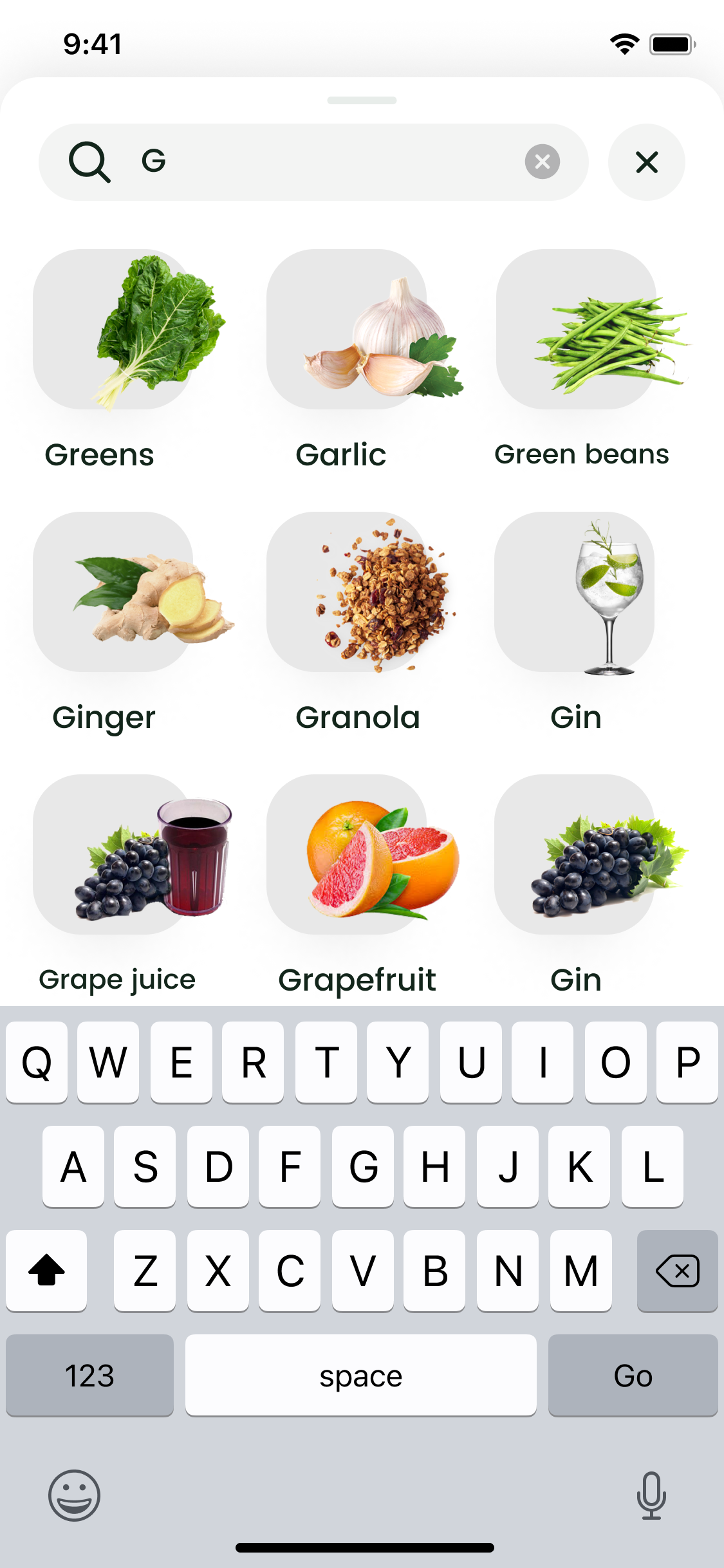
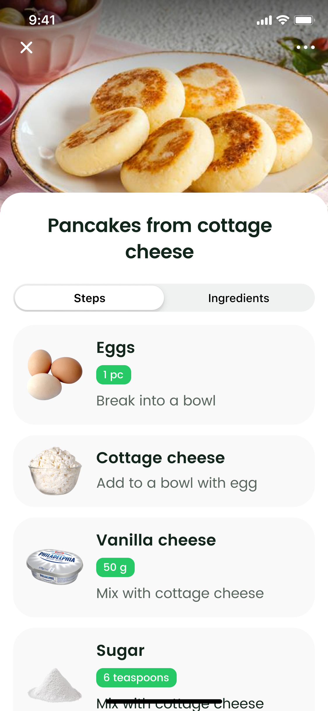
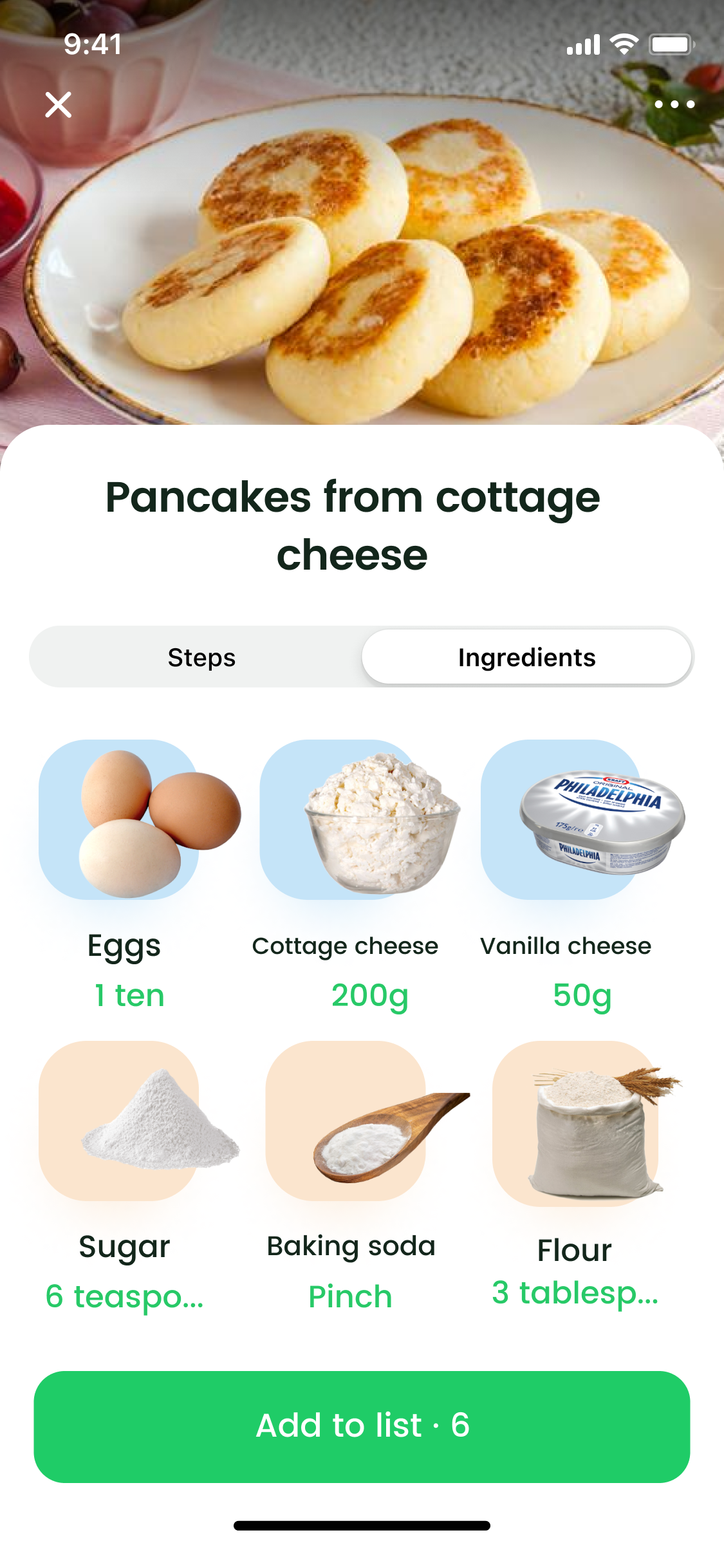
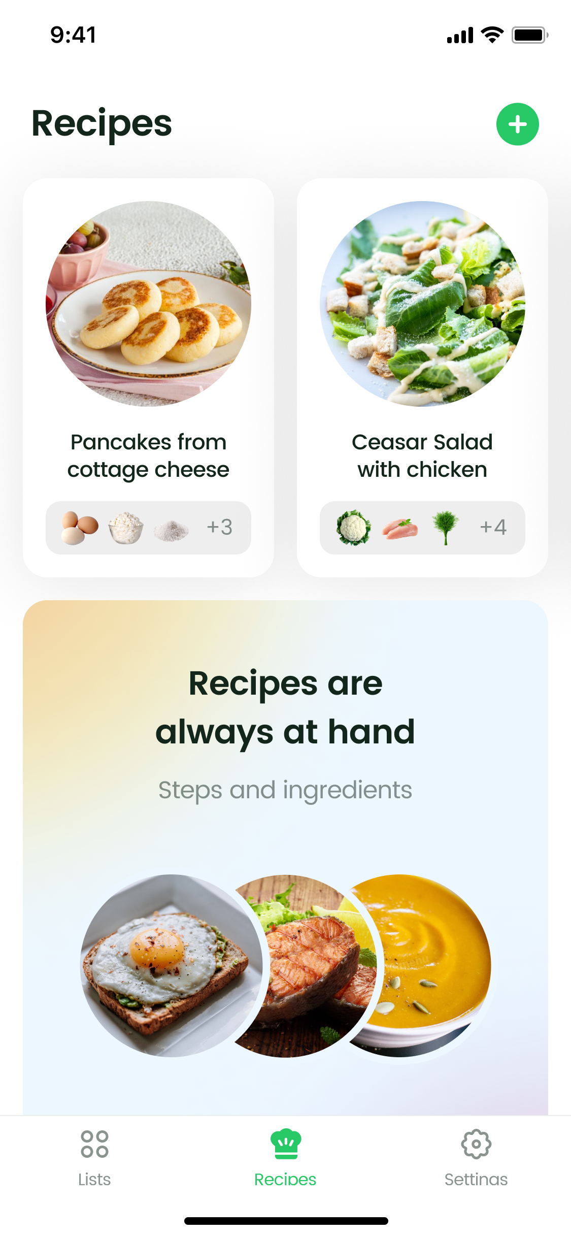
Increasing Traffic With Recipes
Now ToBuy is listed mostly for "shopping list" keyword. We expect implementation of recipes will widen traffic via new searchable keywords in title.
Also we expect recipes to create a habit and build user investment into app, because people could add their content and use it during cooking. We expect recipes to increase user engagement and affect such metrics as retention, DAU, number of subscription events.
Also we expect recipes to create a habit and build user investment into app, because people could add their content and use it during cooking. We expect recipes to increase user engagement and affect such metrics as retention, DAU, number of subscription events.
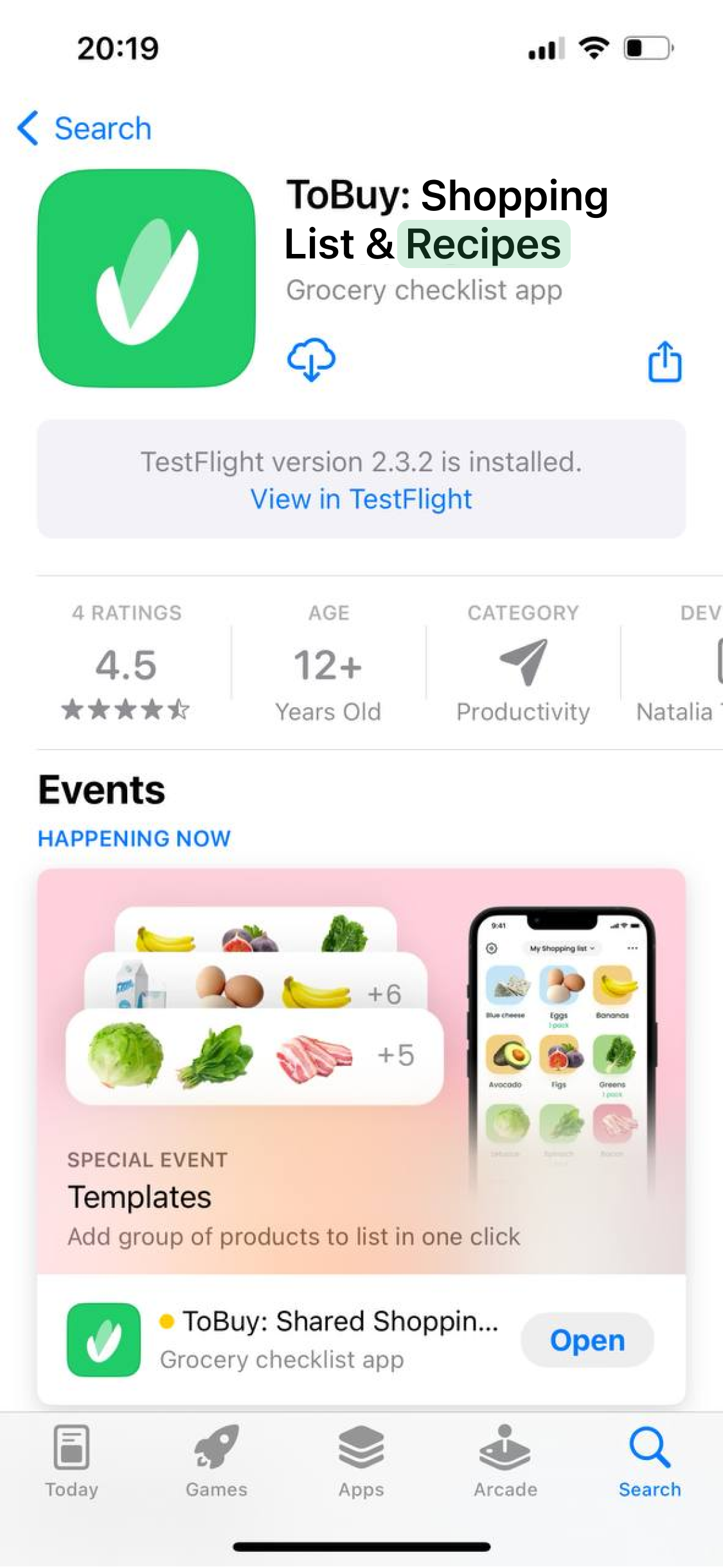
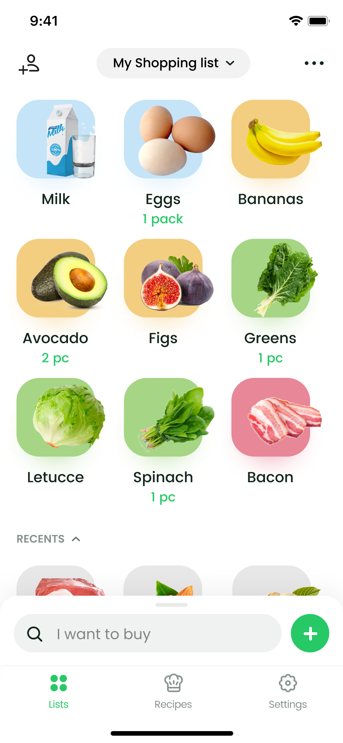
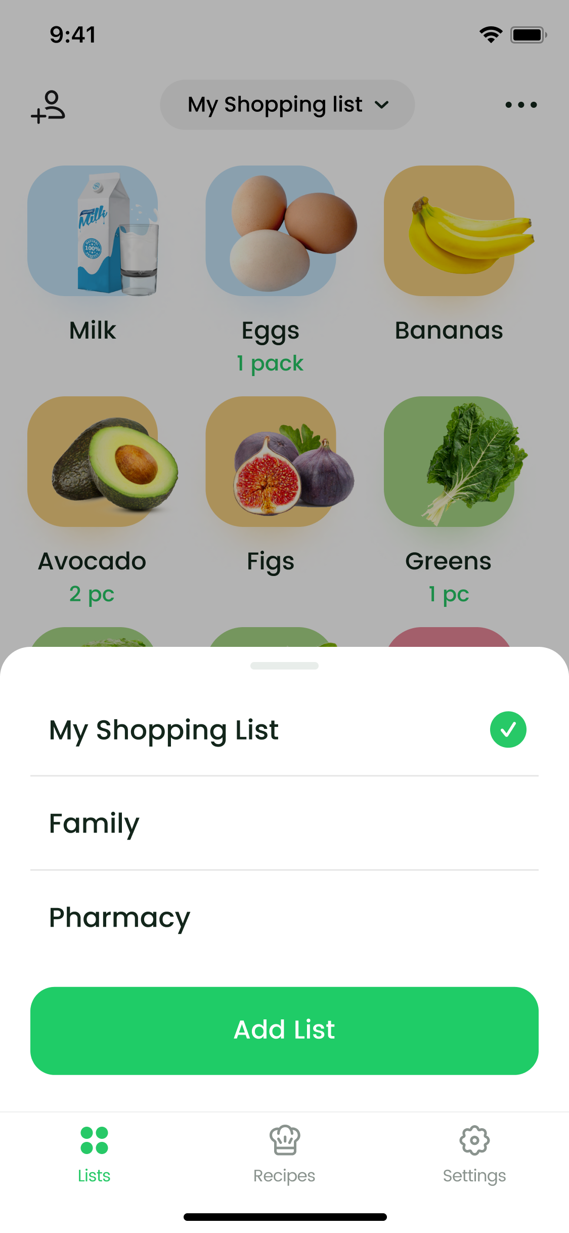
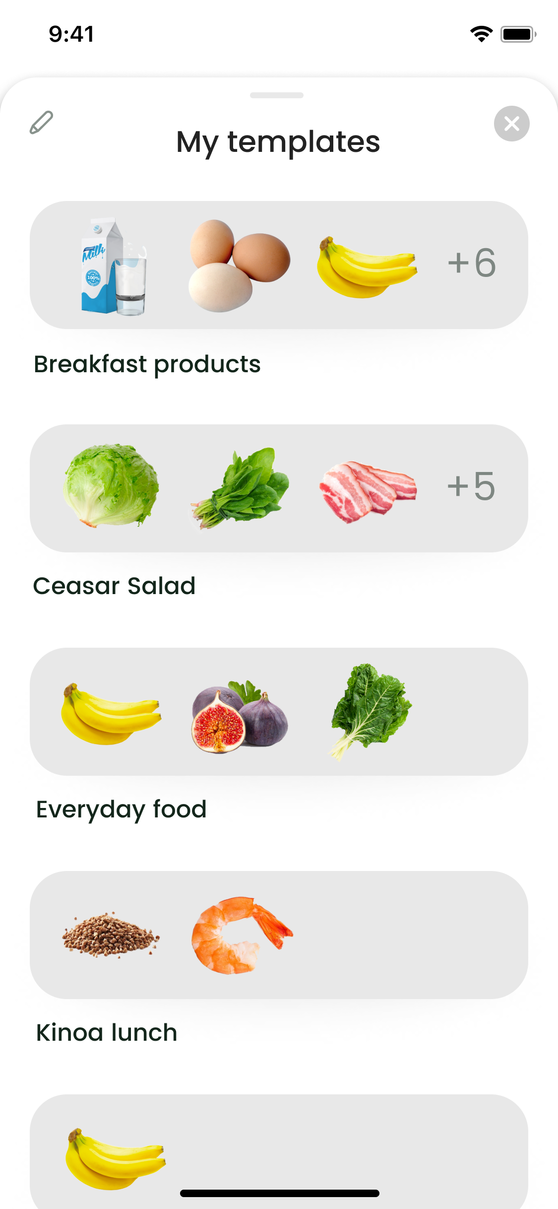
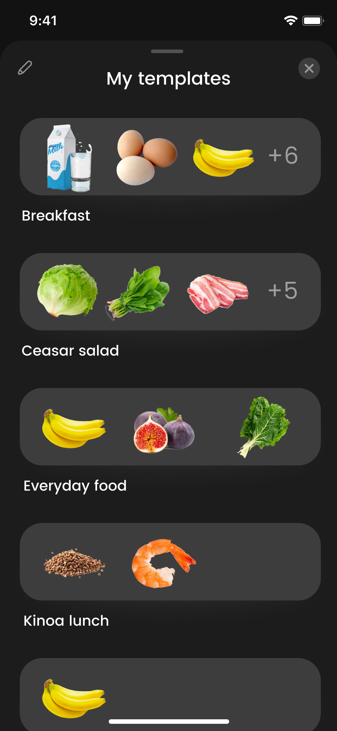
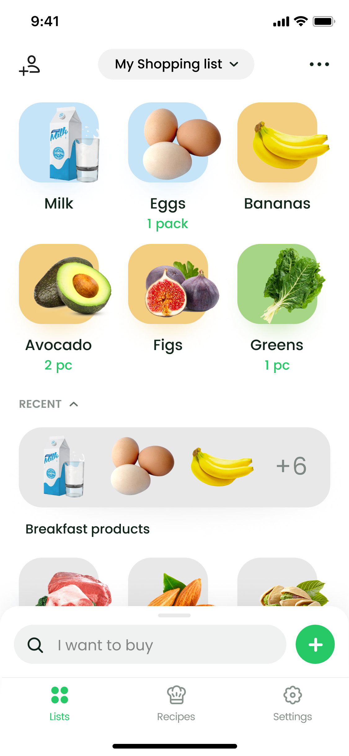
Templates As An Iteration Step To Recipes
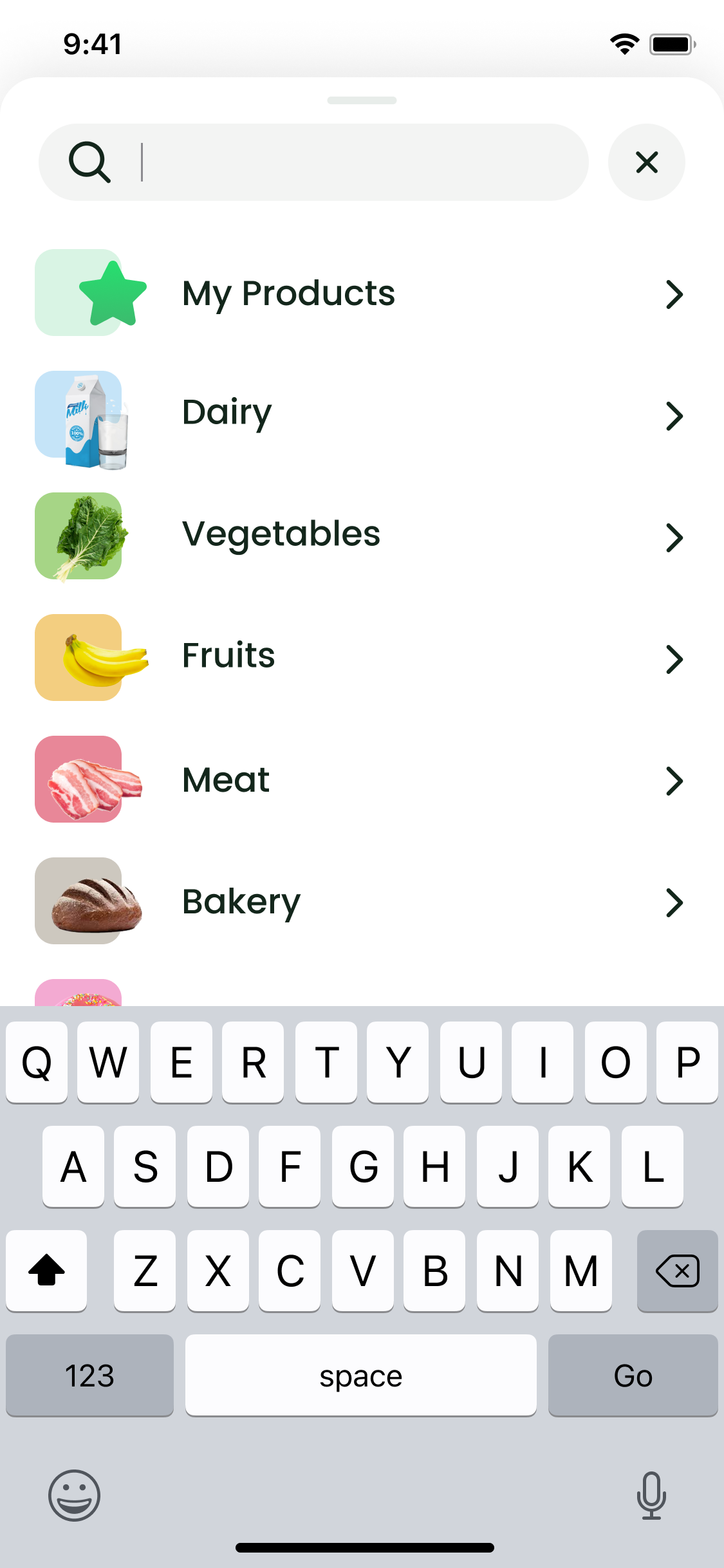
"Recipes" is a huge feature that includes adding ingredients to shopping list. Along with thinking about recipes we saw users sending us feedback, that they want some kind of template to add groups of frequently used products to list in one click.
I offered a solution that templates could be a part of recipes and we should start with them. After developing and launching templates development time of recipes decreased significantly. Recipes also inherit the UI of templates that people are used to.
I offered a solution that templates could be a part of recipes and we should start with them. After developing and launching templates development time of recipes decreased significantly. Recipes also inherit the UI of templates that people are used to.

Animations
Features preview and icons micro animations
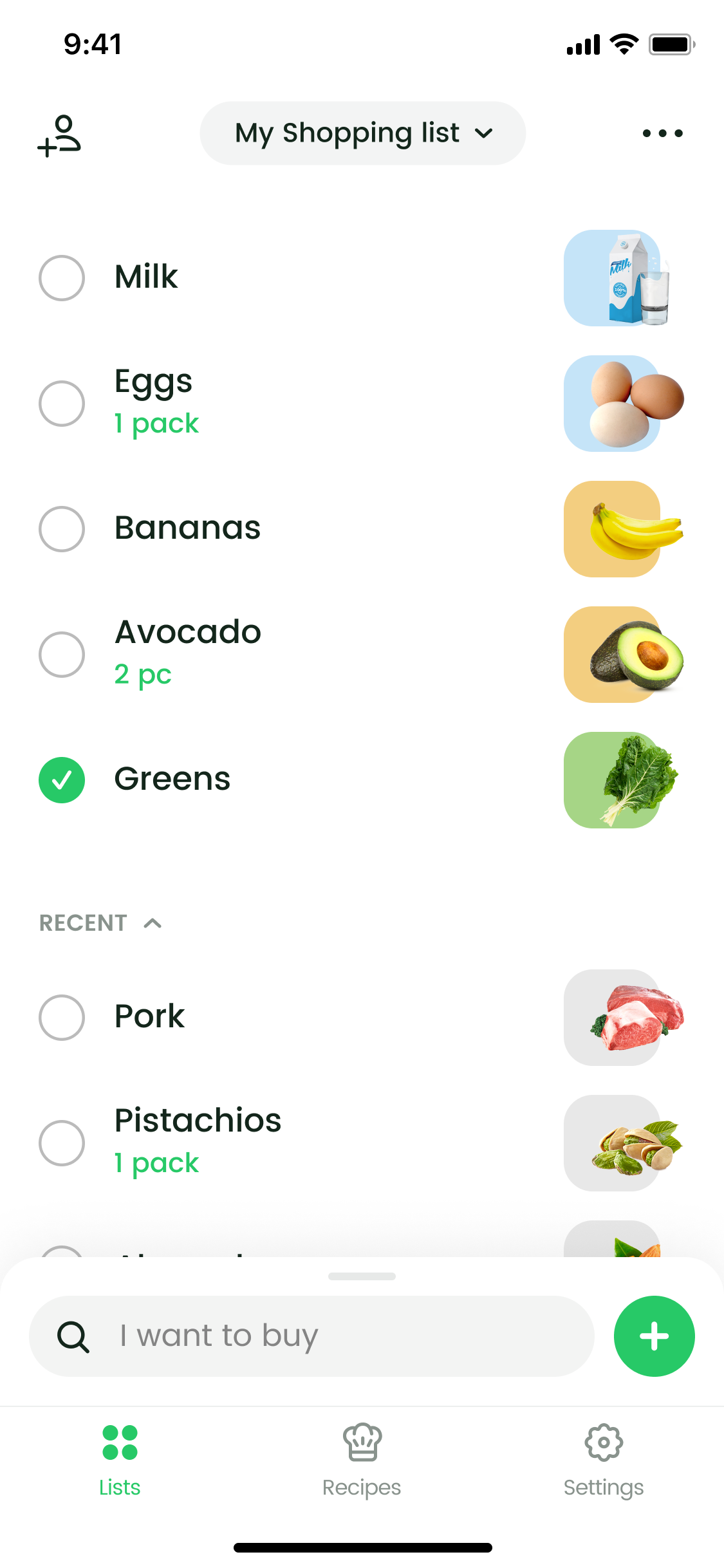
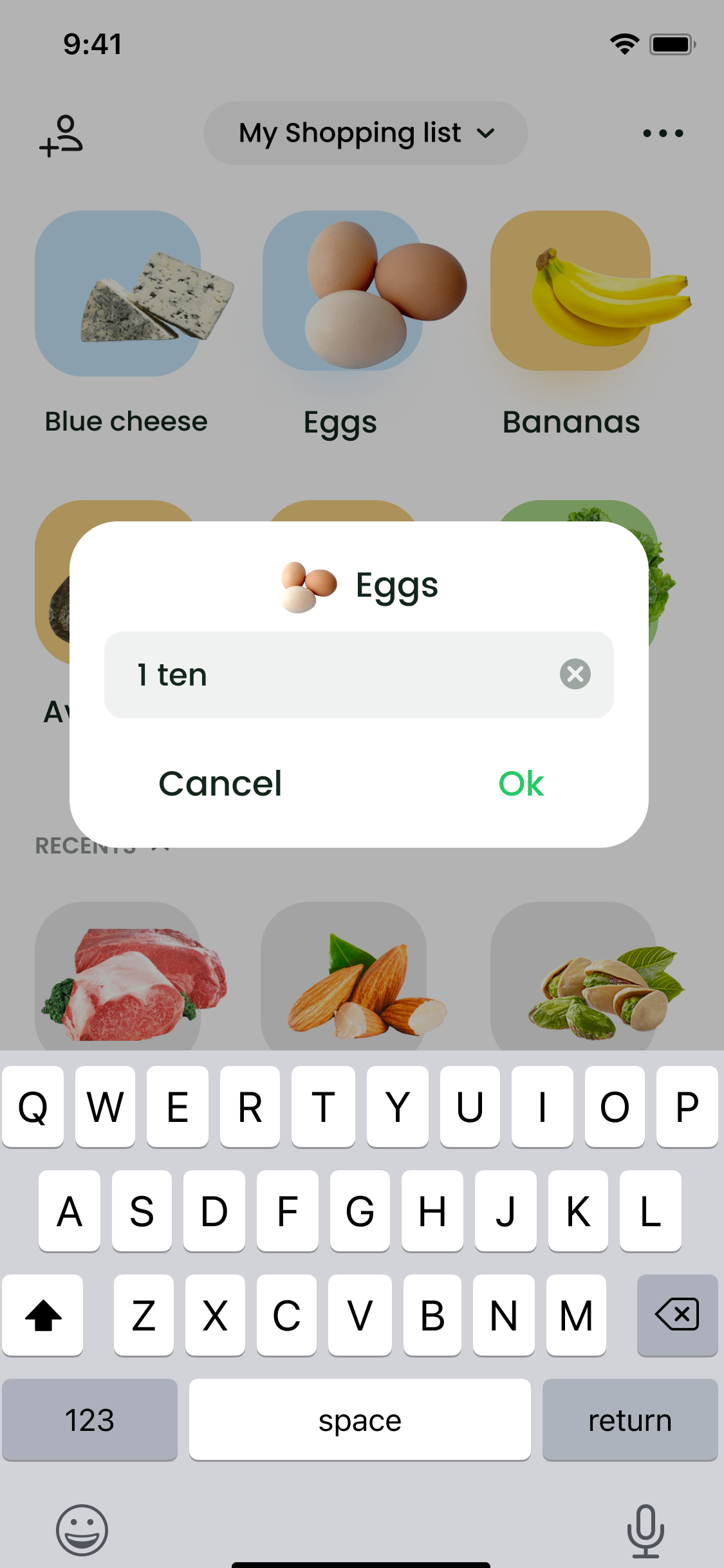
Check products in list
Tabs icons micro animations
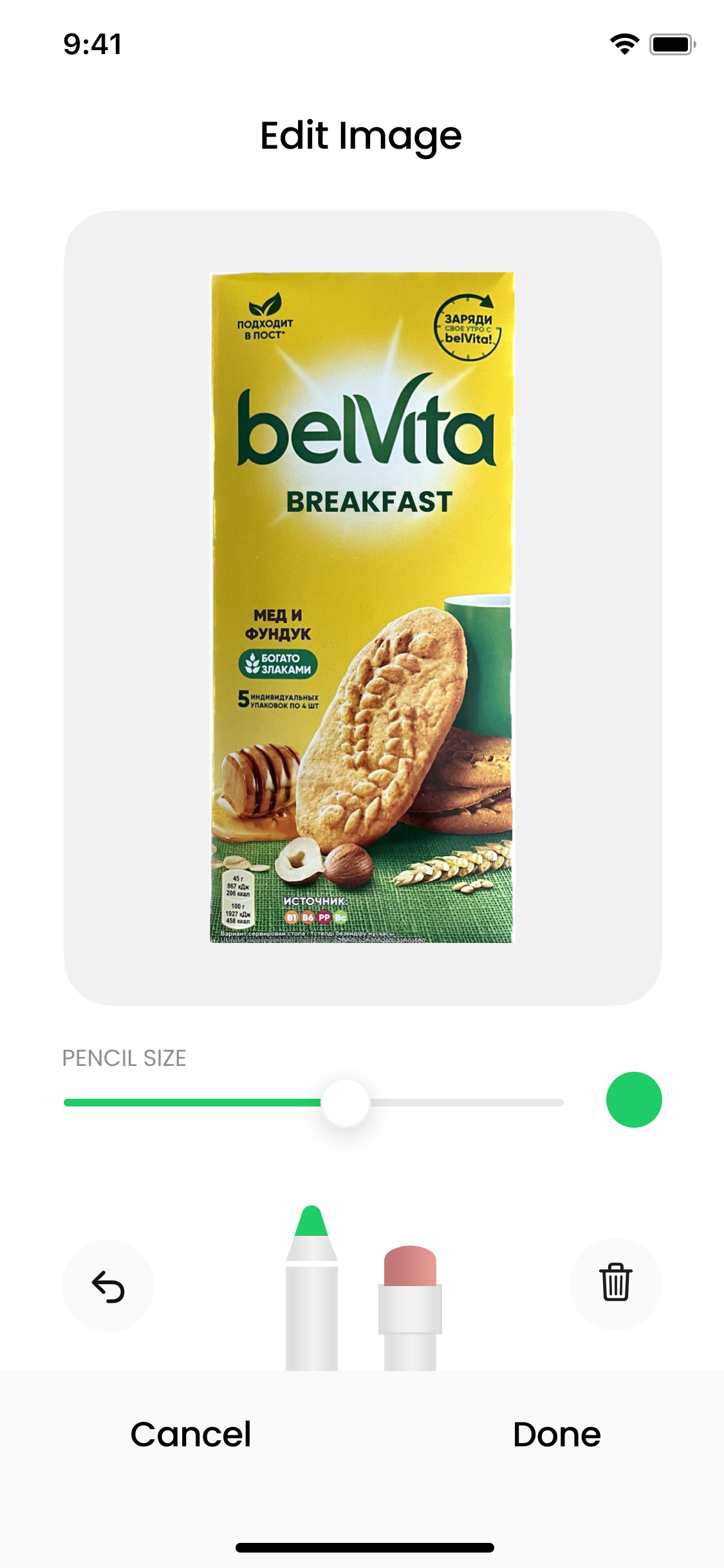
Ingredients added to list
Visual style
Colors, typography
Typography
Aa
Poppins
Regular · Medium · Bold
Aa Bb Cc Dd Ee Ff Gg Hh Ii Kk Ll Mm Nn Oo Pp Qq Rr Ss Tt Uu Vv Ww Xx Yy Zz
Colors
#27C967
#2B2B2B
#CACFD5
Additional colors
#C5E4F8
#F3CE80
#A6D586
#CDC8BF
#F3AAD2
#E88798
#83C1E3
#FFF1CE
#97DEDA
#E9D0F2
#FBCFE8
#FBE5CE
#F3CCCD
#D5C8FD
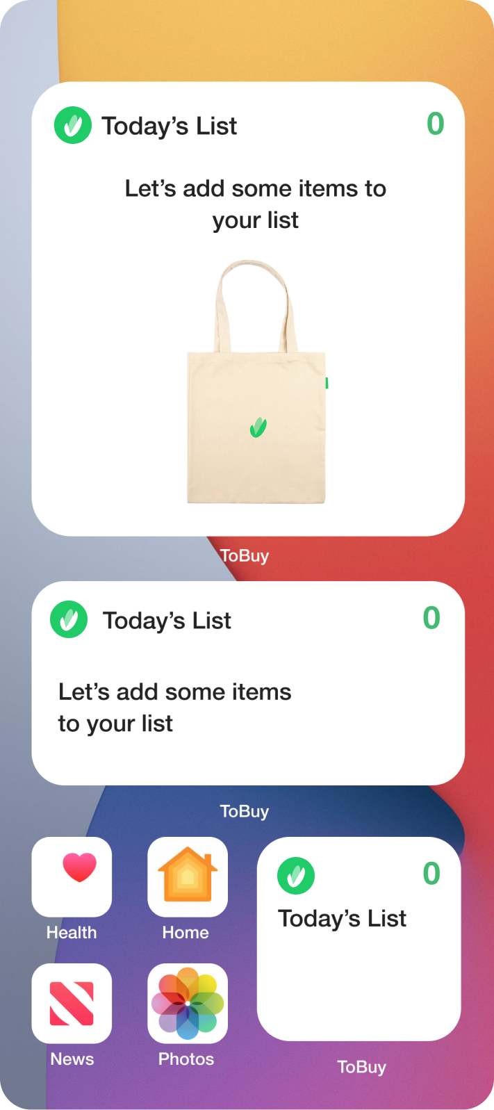
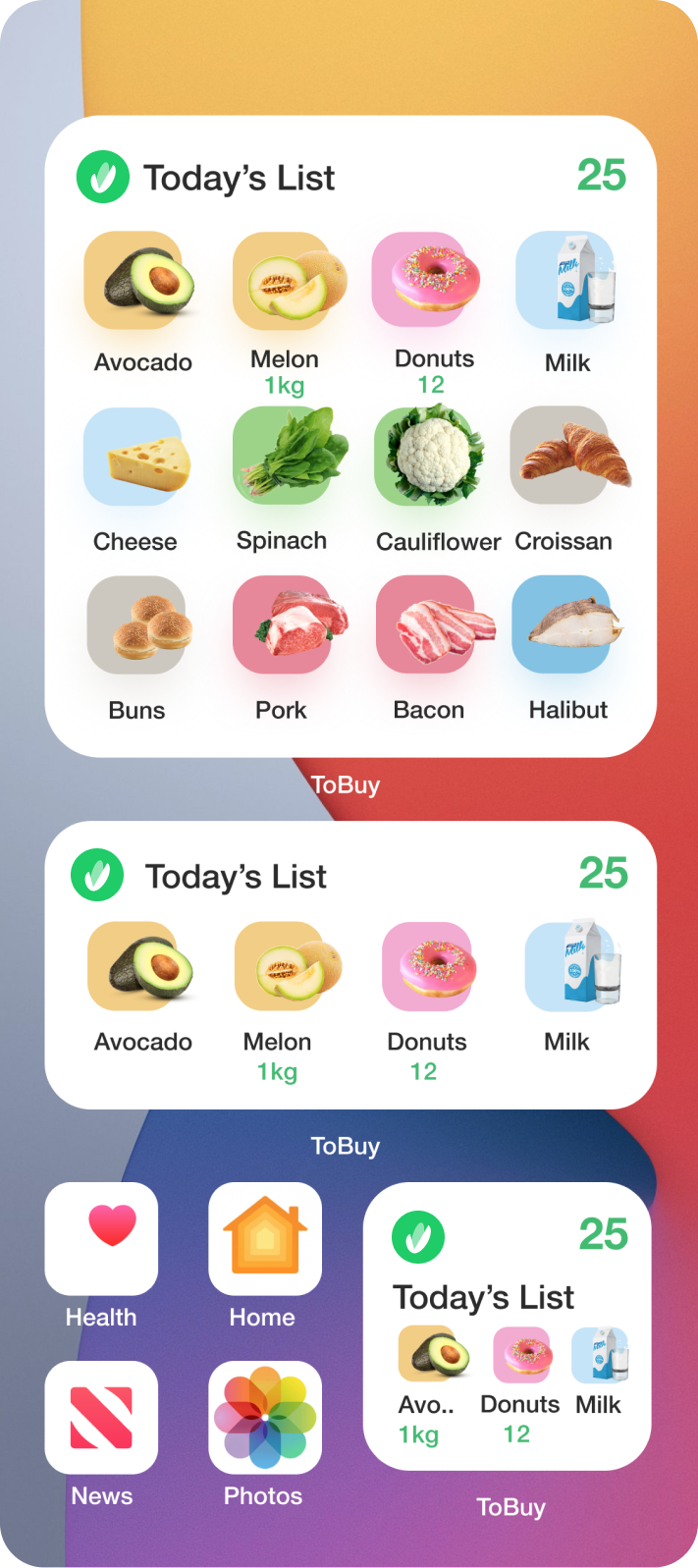
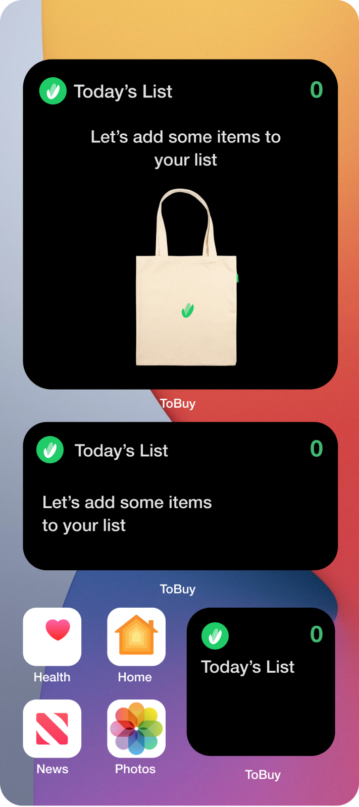
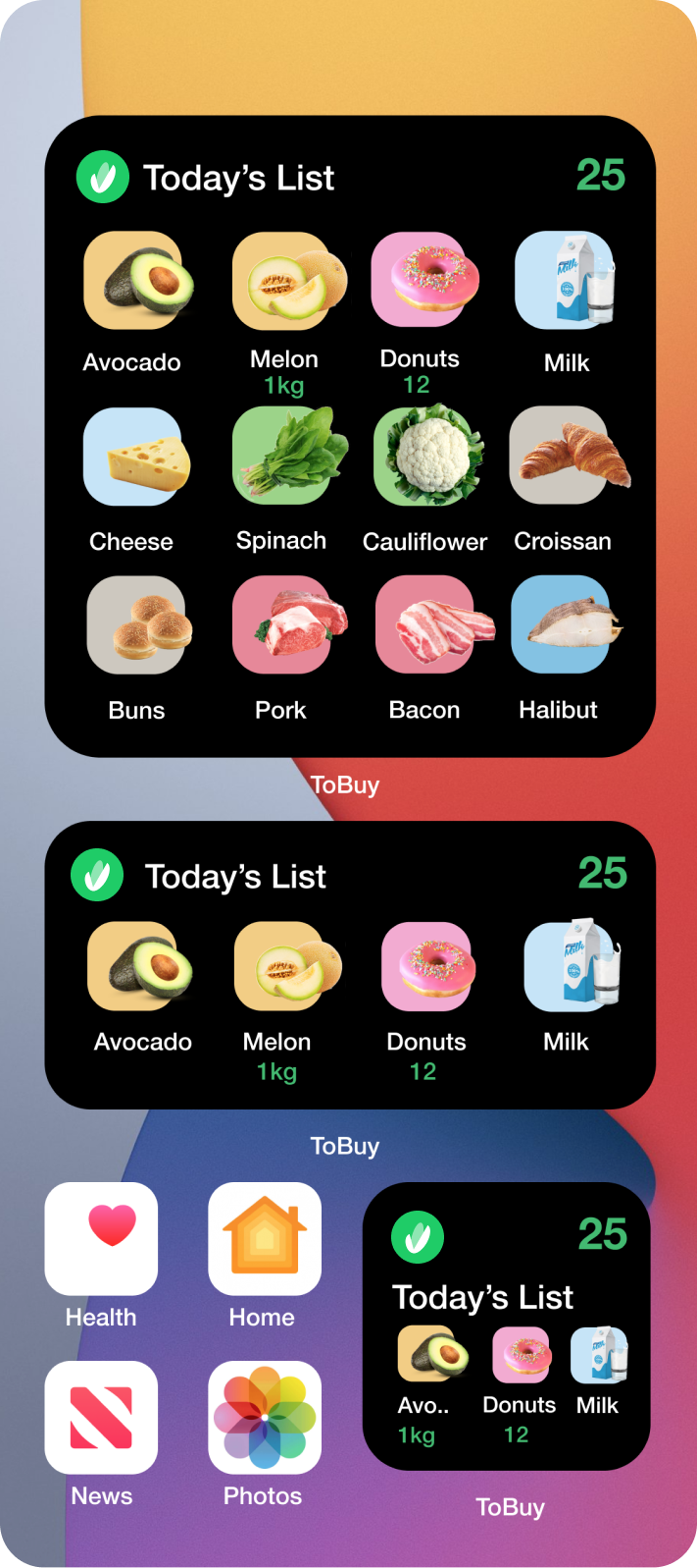
Homepage Widgets
3 types of widgets available
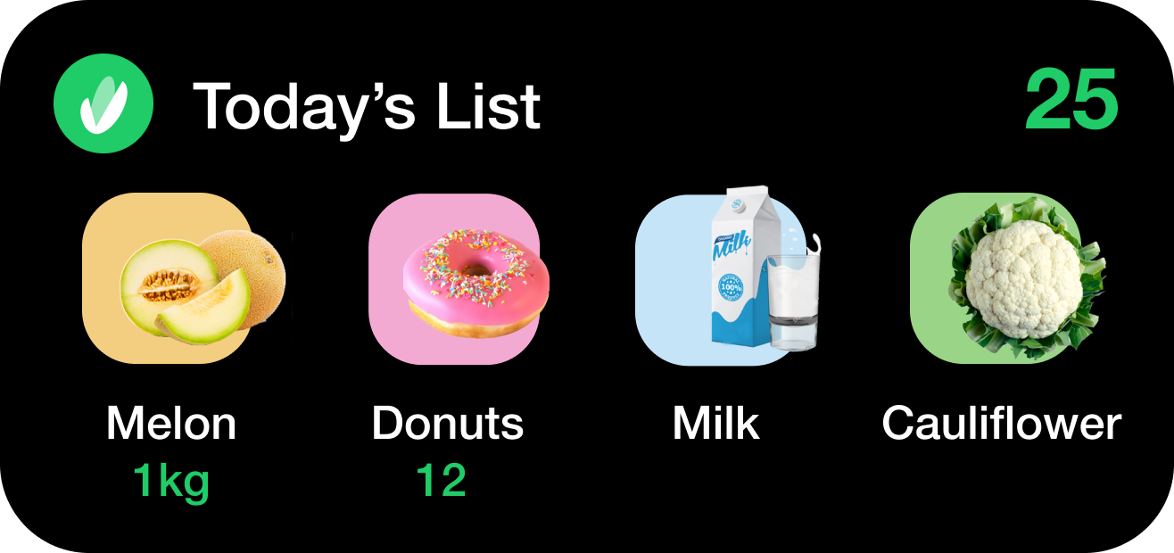
Large
Large: light mode
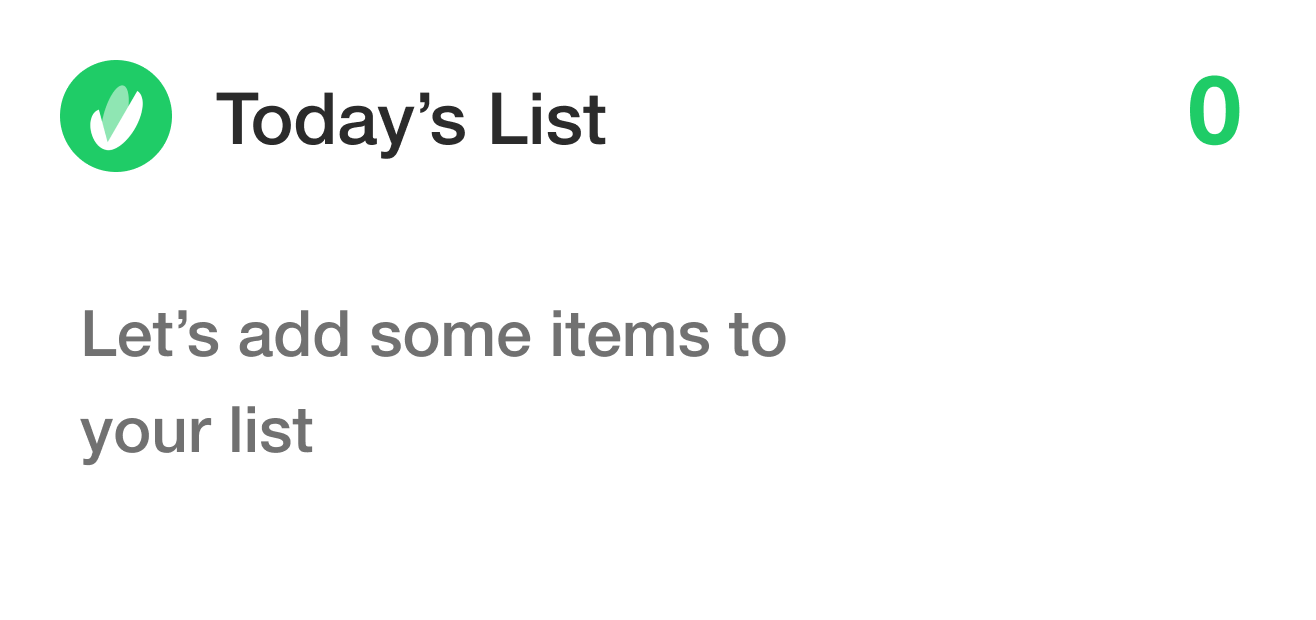
Large empty: light mode
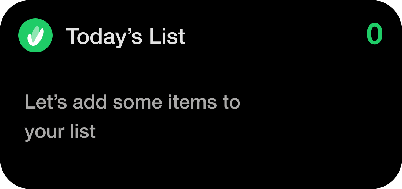
Large: dark mode
Large empty: dark mode
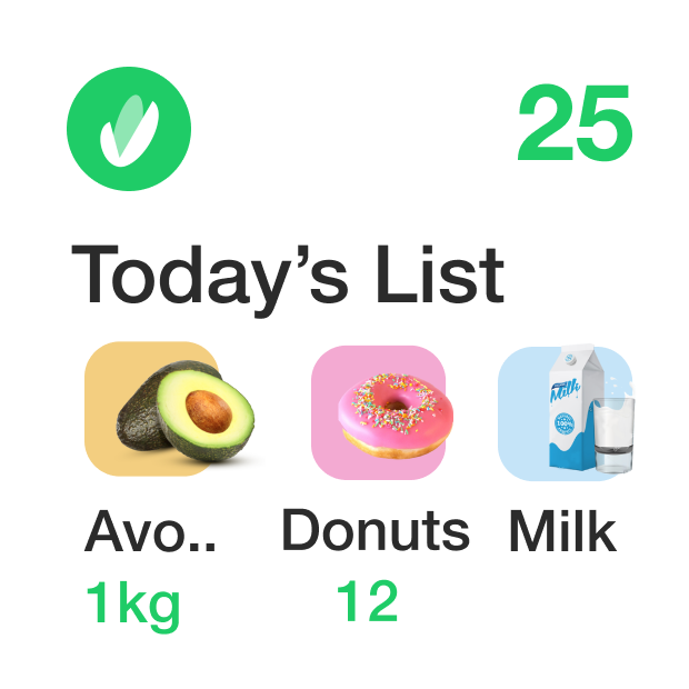
Medium
Medium: light mode
Medium empty: light mode
Medium: dark mode
Medium empty: dark mode
Small
Small: light mode
Empty: light mode
Small: dark mode
Empty: dark mode
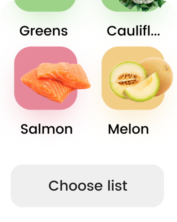
Screens
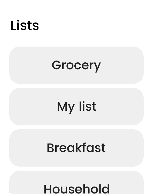
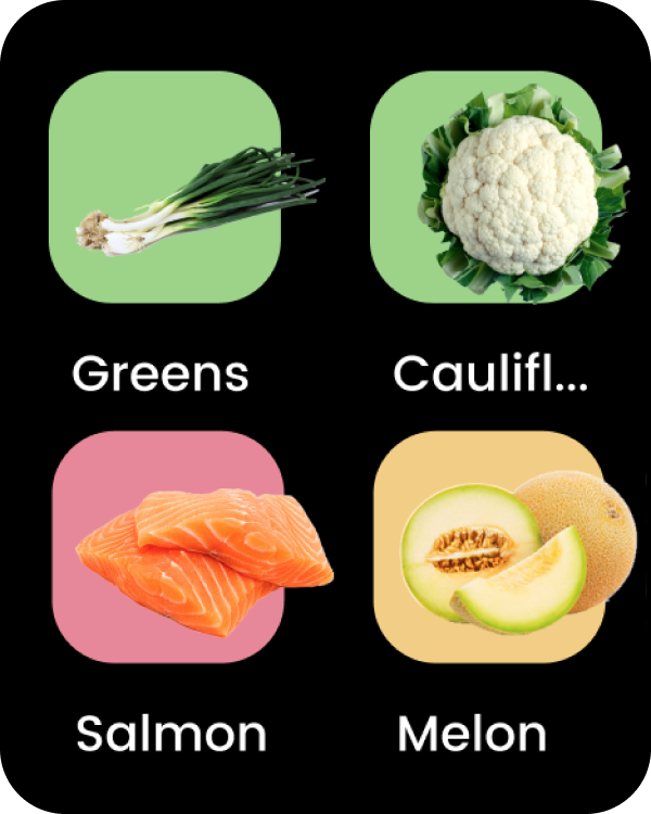
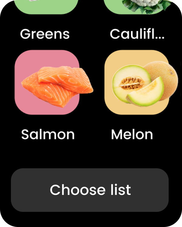
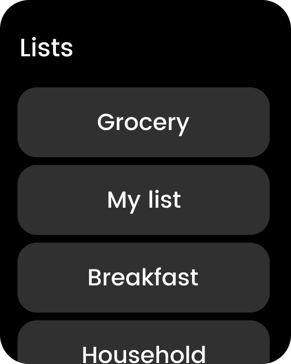
Apple Watch
WatchOS adaptation
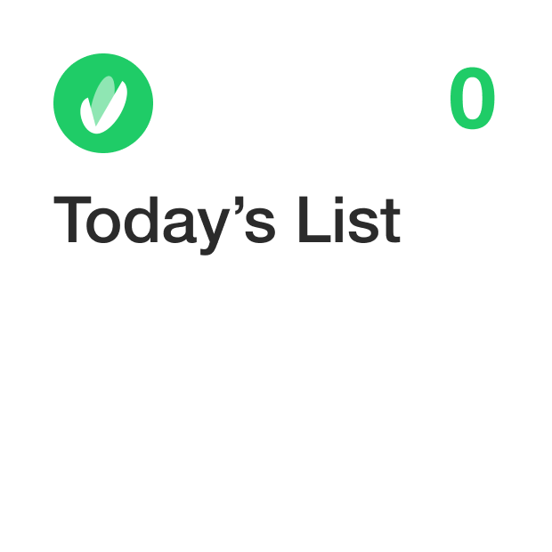
List: light
Choose List: light
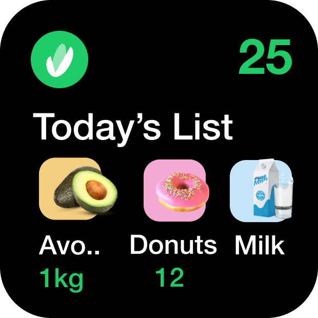
Multiple lists: light
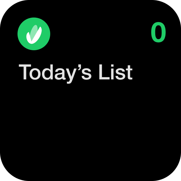
List: dark
Choose List: dark
Multiple lists: dark
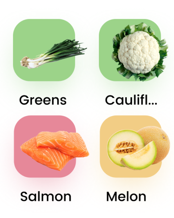
Icon
The idea of an icon is a check point of a list but styled as a product
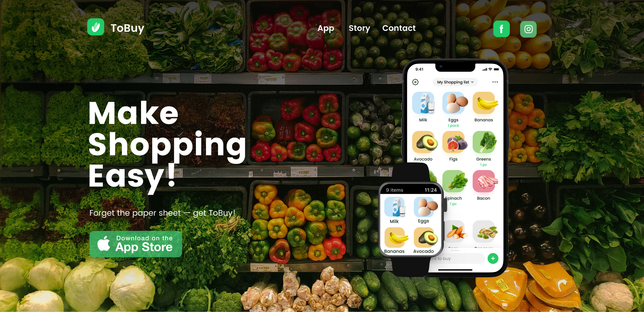
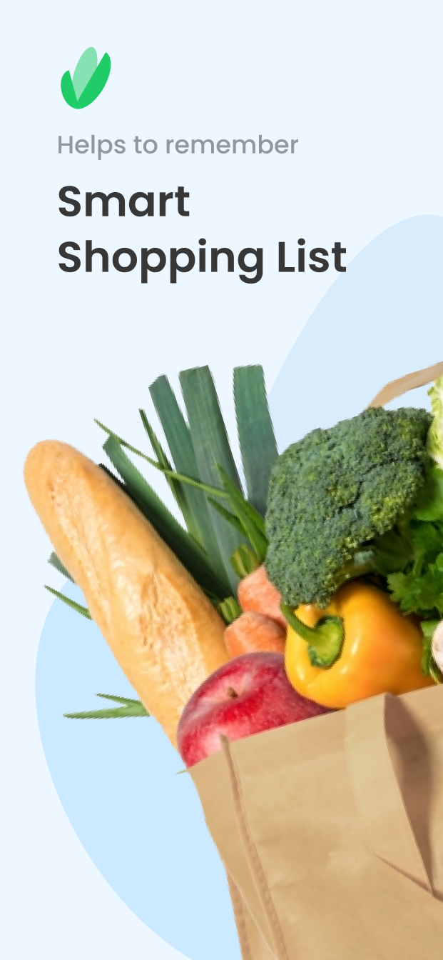
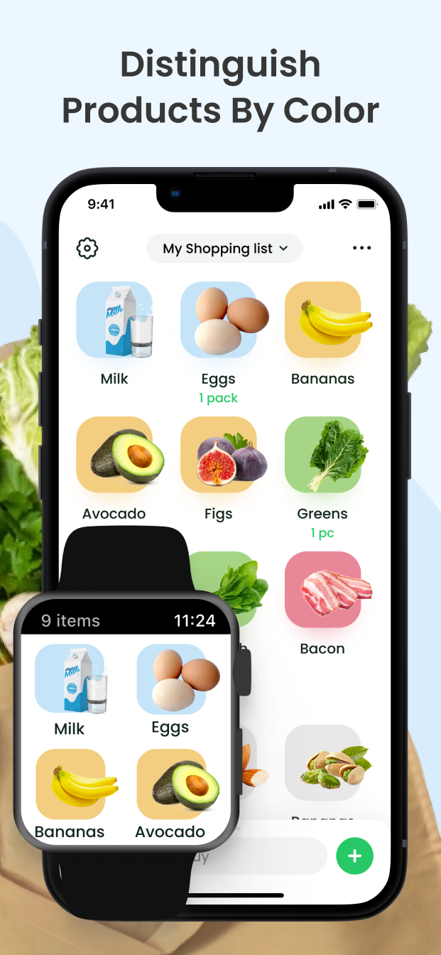
Website
ToBuy App landing Page
AppStore
Screens
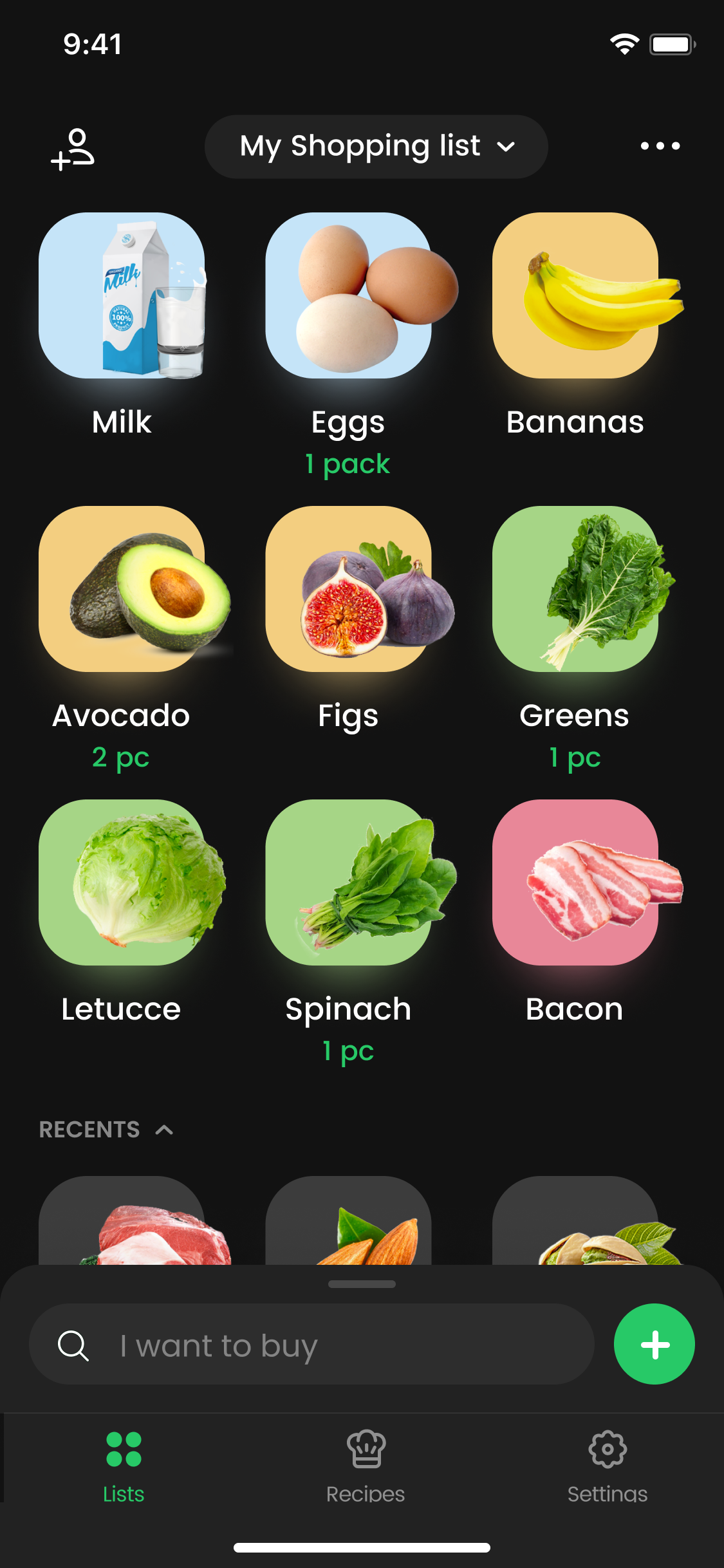
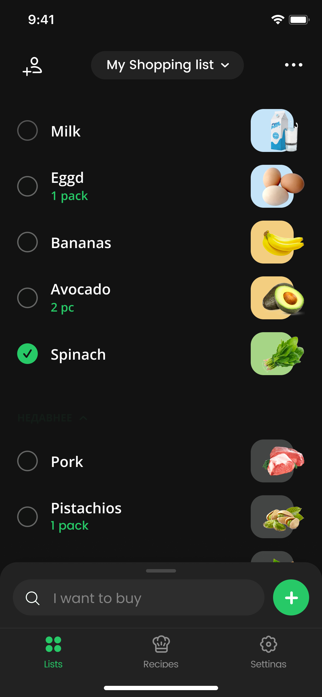
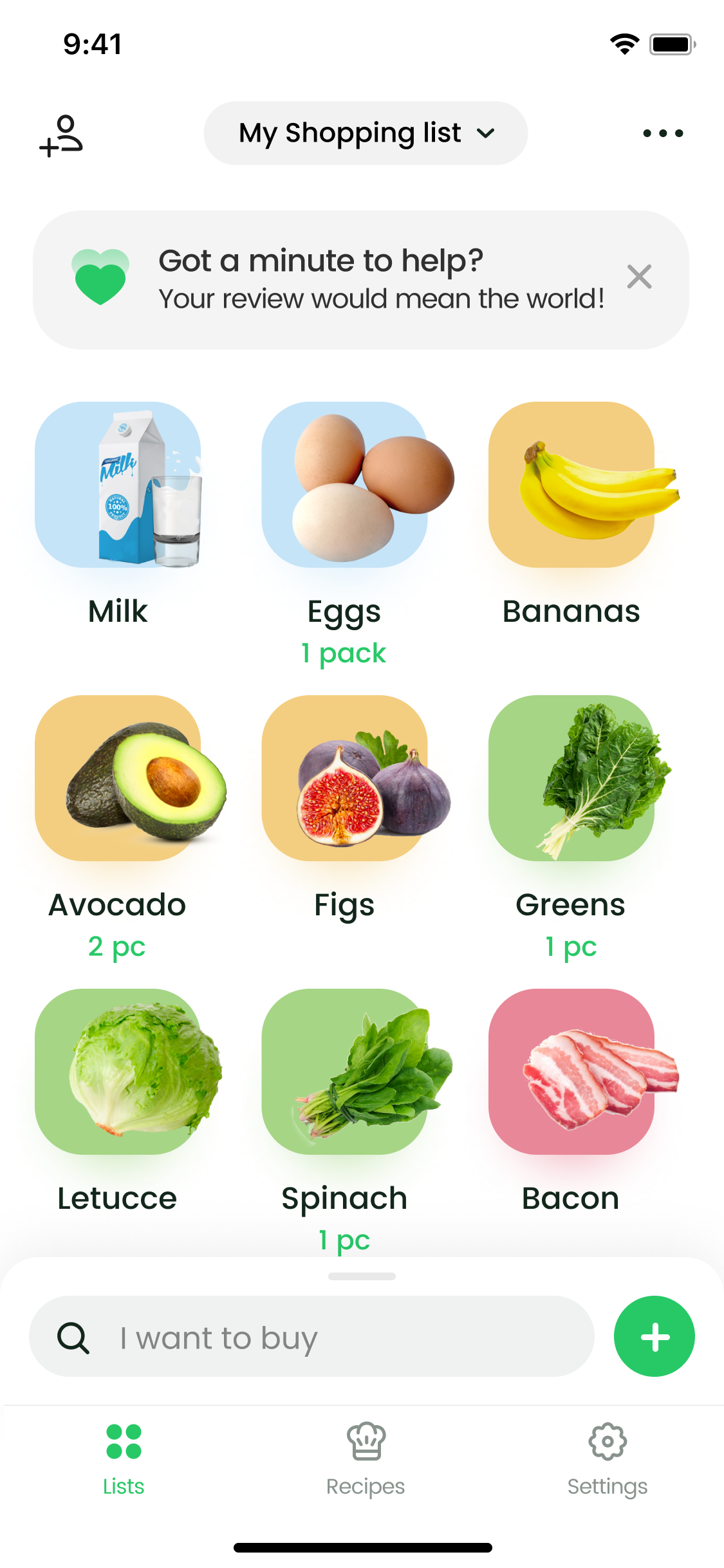
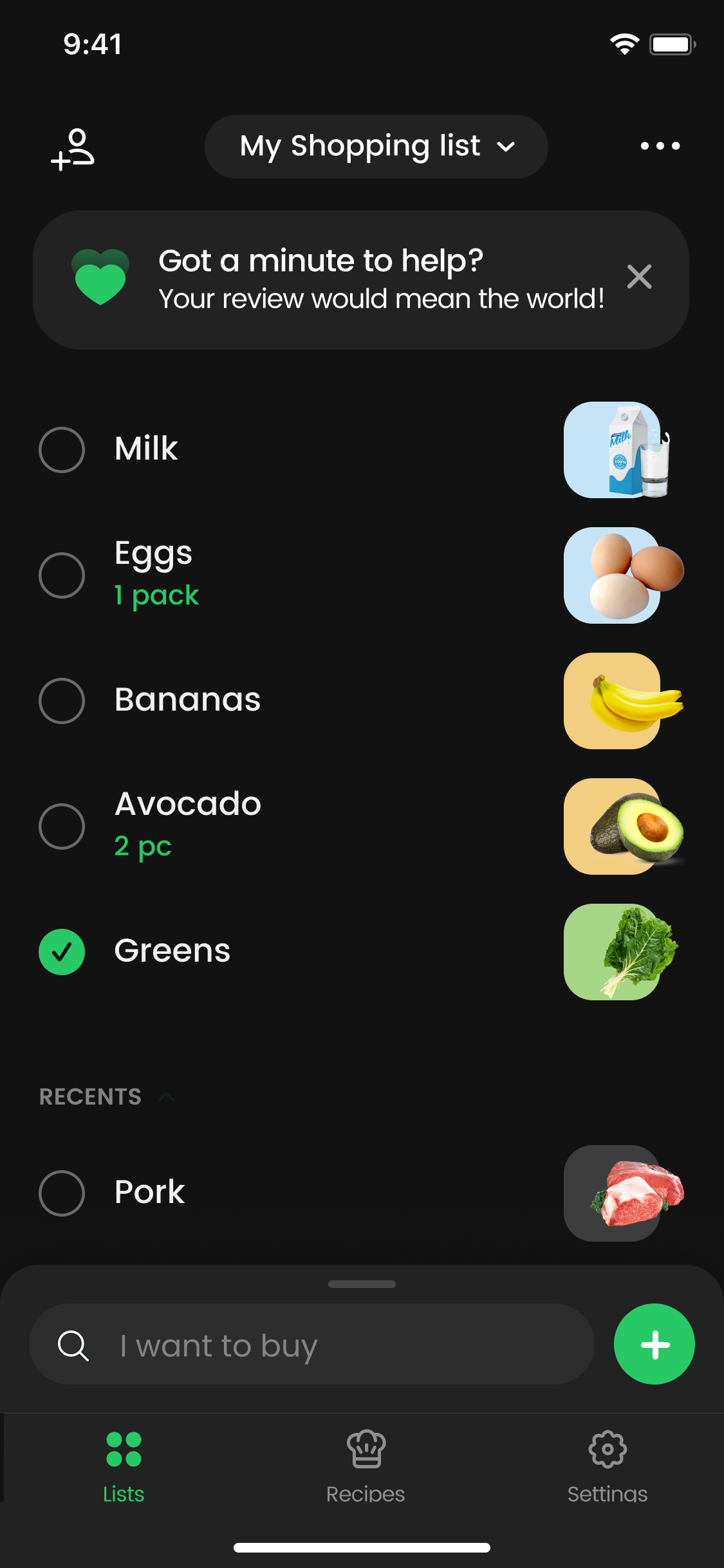
ToBuy — Shopping List
Simple grocery list
Thank you for watching!